Seems that Moschino really fully understood the term McDonaldization.(I encountered this term while studying sociology!)
This collection was heavily inspired by McDonald and other popular icons. If you look at one perspective, yes it is refreshing to have a designer collection interpreting world renowned decades-long fast food restaurant, well known cartoon character, popular snacks into something wearable(onto the clothes) but on the other side, it is SO heavily inspired that it is basically a copy with a little added twist. And it's a very expensive one.
For the 'McDonald' theme, it feels that they are actually marketing McDonald, or either that they are using McDonald to market themselves? Either way, both of the companies are internationally well known and it might be a collaboration between themselves? If not, will there be lawsuit due to the resemblance?(McDonald Legal cases)

I can't stand the way she act and walks.


I must say, the accessories are undeniably cute.
I would totally wear the 'M' sunglasses, and hop around like a little kid while carrying the happy meal bag or the drink bag and occasionally trying to "peek into the bag for a happy meal toy" or "drinking through the straw".
It reminds me of:
McDonald, Cow, Chanel Suit, Cap toe shoes from various brand(2012 Trend)
 +
+
 +
+
Source: Google
The next theme: Bad-ass-gold-chain Punk!


Although I read someone's comment that this dress is nice. I beg to differ.
I'm not fond of the neckline, just don't find it flattering.

I like this light blue denim quilted style. Very edgy yet 'soft'.


She is carrying a Biker-Jacket-style bag! It is AMAZING! I LOVE IT SO MUCH!


The bag top is interesting. Initially when she walk out, I was thinking did he just slap on a bag onto the bandeau top? but actually it was merged with the top.


I like this! The dress is so hot!
Designed in a way that looks like multiple belts being join together.
I like the badass leather style with all the gold Moschino all around it.


My favourites are the tiny bag necklace/ belt, the iconic chain belt and the Biker-Jacket-style bag.
It reminds me of:
Chanel Classic Flap, Chanel Jacket, Mr T gold chains, Men's White Brief, Cap toe shoes from various brand(2012 Trend), Selene in Underworld
 +
+
Source: Chanel.com
 +
+ +
+ +
+
Source: http://www.fanpop.com/clubs/underworld
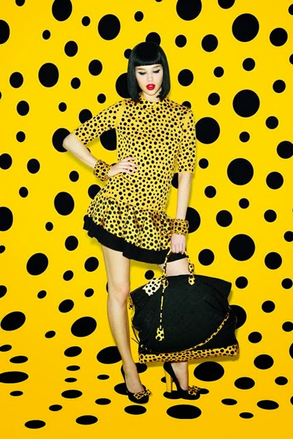
Next, Spongebob. I like spongebob. but this is just bad! plain hideous! Don't it remind you of Louis Vuitton x Yayoi Kusama collection 2 years back? I find that collection rather DOTTY(Pun intended).


"Cruella de Vil managed to get her dalmatian fur coat?!"


It reminds me of:
Spongebob meets Louis Vuitton x Yayoi Kusama.
Source: louisvuitton.com spongebob.nick-asia.com/
And last of all, Food packaging.

"The Evil Red Queen."


I actually find this looks cute.


"Just the thing you need when you're going to the movie theater."

"Badly wrapped up"

I think this dress would look really good without the print.


"A constant reminder of what you're consuming."
It reminds me of:
Food packaging. Duh.
Food packaging. Duh.
Conclusion:
It was way too heavily inspired like I mentioned in the start. And if you have realised by now, the shadow of other brands seems to lurk around.
I agreed with some of the comments that it look cheap and almost like a toy(regarding the 'Mcdonald' theme) but it is cute. If not for the hefty price tag, I think it is fine to grab some of the cute accessories.
There are some which caught my eye, like the Biker-jacket style bag but most are meh.
Moschino.com
Moschino.com
On a side note: What's with that terrible music? For the initial part, did Jeremy Scott record his own singing and mix it? then there is this part where there is a girl moaning! I was watching it in the middle of the night with my parents room just next t me. Jesus Christ! I was really irritated by the music while watching the runway!

